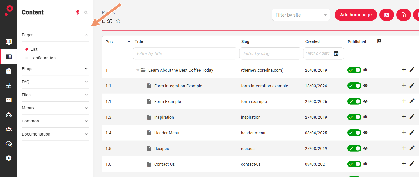
The pages module controls the page content. The pages module can be found on the menu under Content » Pages.
It is also possible to create page hierarchies and organise pages into groups. In this case the page URL’s will be reflected as per the hierarchy setup. It is also possible to override the URL structure by assigning “custom urls” to a page.
The Pages application is located under the Content applications category:
Manage Pages
Menu options
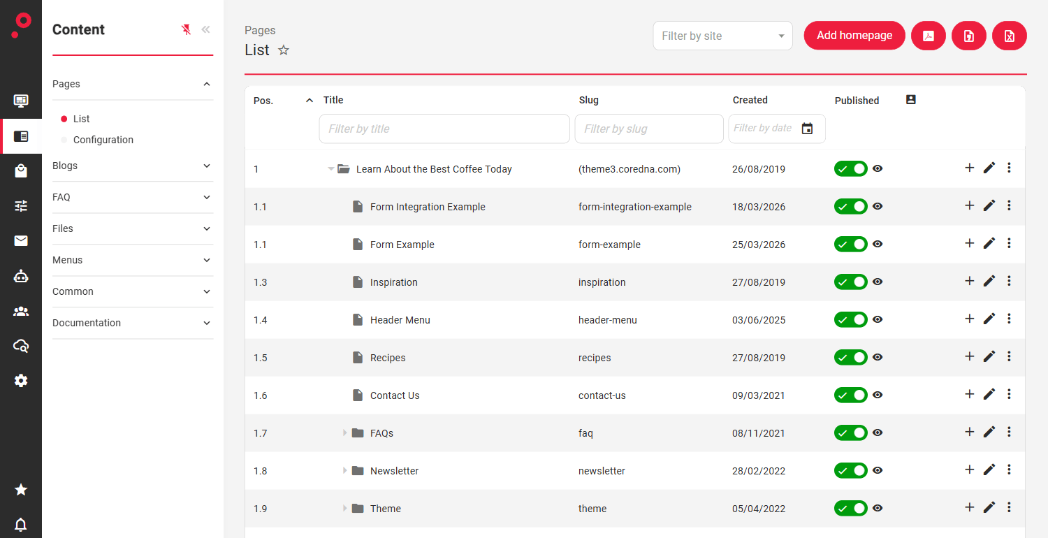
List - Lists all the pages, both published and unpublished. This is where you can create new pages, edit and delete existing pages.
Configuration - Controls options for tagging & category support, as well as how the page tree list is displayed.
List Pages
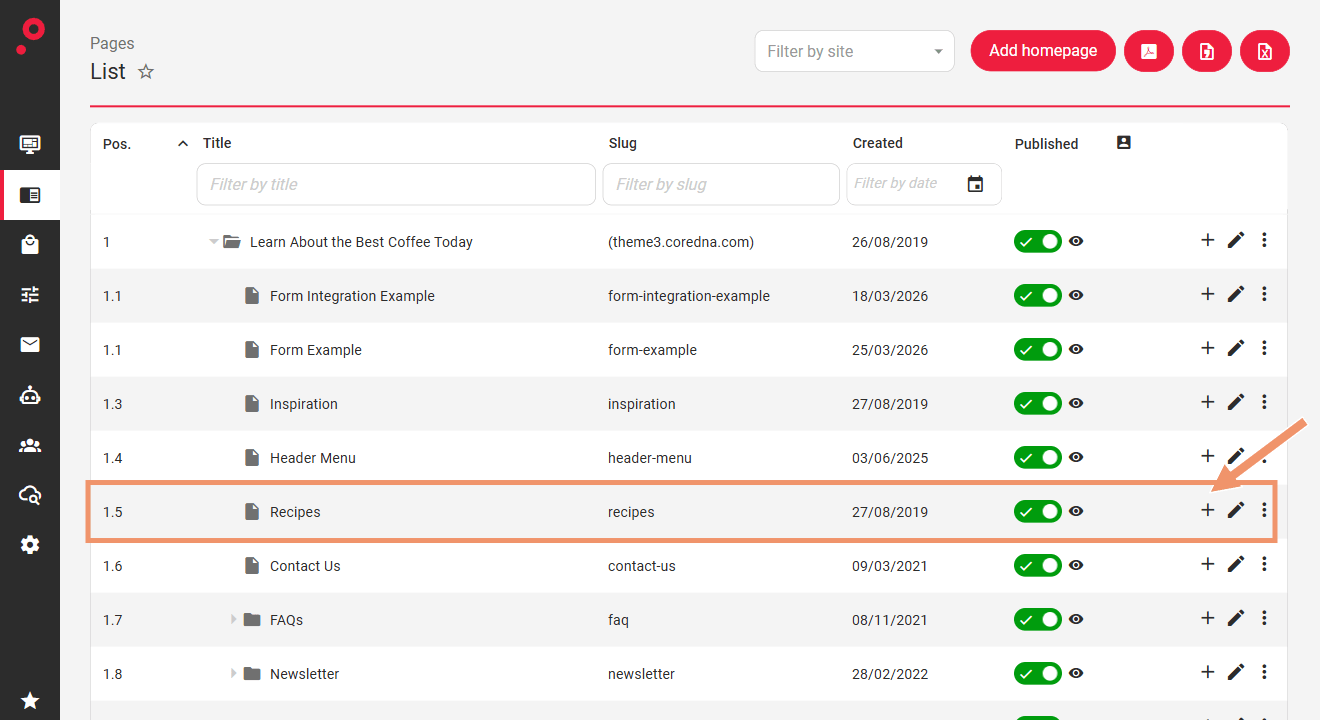
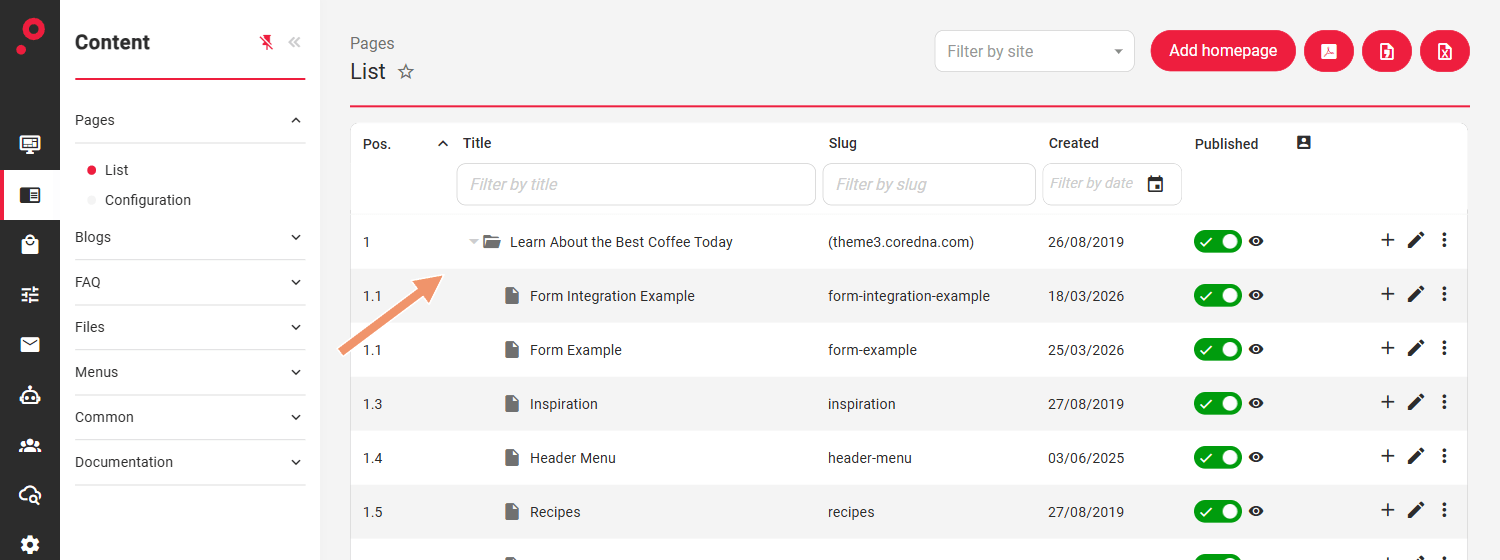
All the pages are presented within a table format. It is possible to filter results by Title, Slug or Created date, as well as reordering the results by simply dragging and dropping the items into a new position (the same action can be performed by editing the page and changing its Parent on the Details tab).
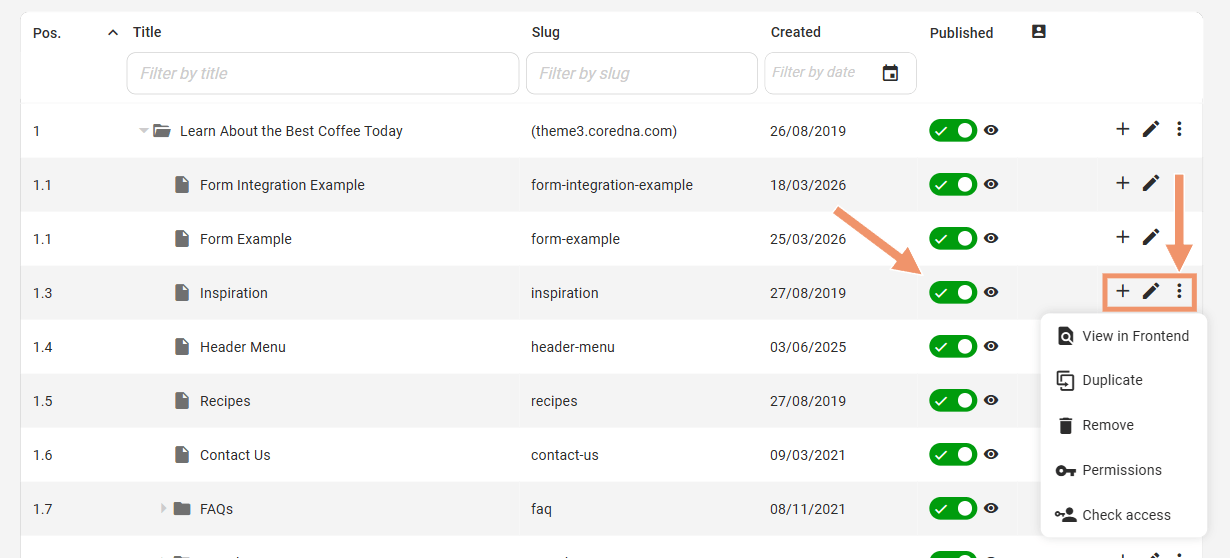
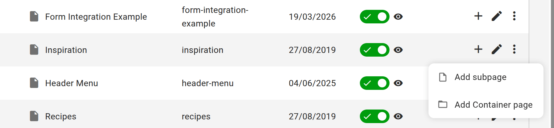
The Published switch on each row changes the page’s publish status from the list. Beside it are the “plus” icon, which opens a menu with Add subpage and Add Container page, the “pencil” (edit) and the “three dots” for more actions:
If permissions allow users can also do the following actions
Add subpage - create a page underneath the current page (the “plus” icon on the row)
Add Container page - create a container page beneath the current page. See How pages are organised.
Duplicate - duplicate the page with the same configuration, including components
View in Frontend - visit the URL that this page is viewable on
Remove - remove the page and its contents from the CMS
Permissions - manage the permissions settings
Check Access - Use this tool to check who has/does not have access to a specific page
Configuration
Within this area, it is possible to modify some of the default pages functionality, such as:
Use tags for pages: Determine whether pages should be taggable. This does not remove existing tags from pages.
Use categories for pages: Determine whether pages should be categorizable. This does not remove existing categories from pages.
Display property to use in tree / hierarchical navigation (Page Title or Page Slug)
Default published: Controls whether pages are published by default (when permissions are sufficient)
Default behavior for new container pages: the Direct URL behavior the add form selects first for a new container page (Return a 404 or Redirect to the nominated page). Changing it does not change existing containers.
Generally, this is not needed once the system is set up.
Create a Page
In order to create a page we first need to determine under which page this new page will live. Once that has been defined click the “plus” icon (Add subpage) on that page’s row.
For example, to create a page under the “Recipes” page click the “plus” icon on the Recipes row:
To add a page on the same level as Recipes, use the “plus” icon on its parent, “Learn About the Best Coffee Today”, instead.
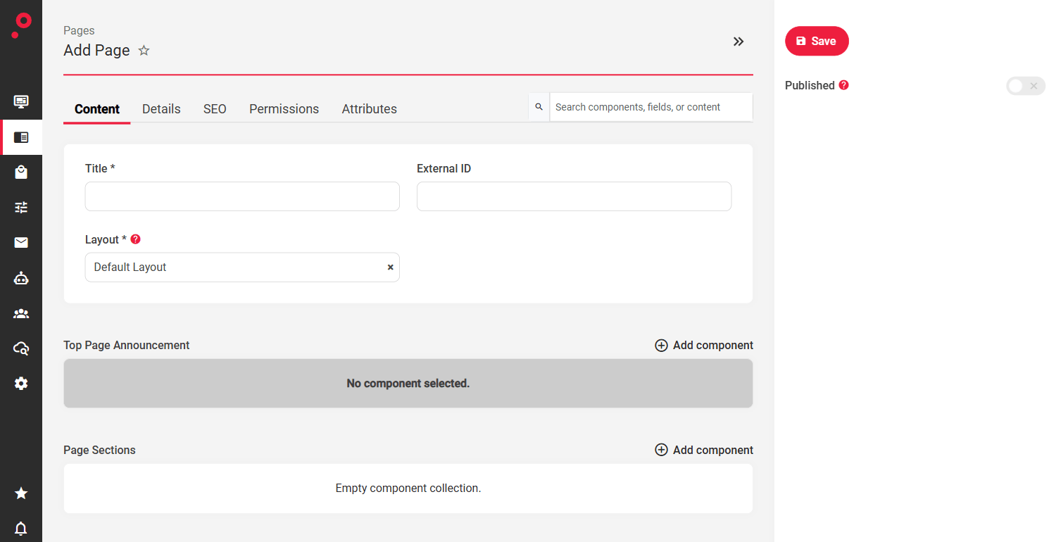
“Add subpage” will redirect to the Edit Page admin where the page can be built and configured.
The Page admin area is divided into five tabs:
Content: this area is reserved for any content related updates such as Page Title, Layouts, Page Areas etc. which also includes the use of components to build unique page layouts.
Details: this area holds specific page information such as Owner, Slug, Parent, Tags, Categories etc.
SEO: this area is reserved for expanding the SEO information on the page by adding SEO Page Titles, Descriptions, Robot Settings etc.
Permissions: use the permissions tool to configure who has access to this particular page. Set Read/Write/Publish/Admin permissions to single users or user groups. On an existing page this is reached from the “three dots” menu in the Pages list.
Attributes: the page’s attribute values, where the layout defines attributes.
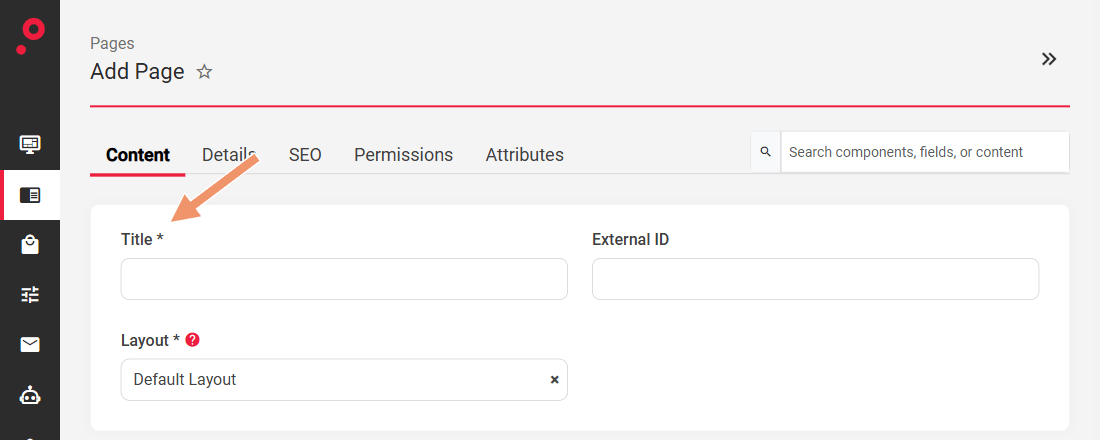
Add the Page Title
The title of the page is used in the listing page. If required Pages can also have an alternative title for SEO purposes (see SEO Settings).
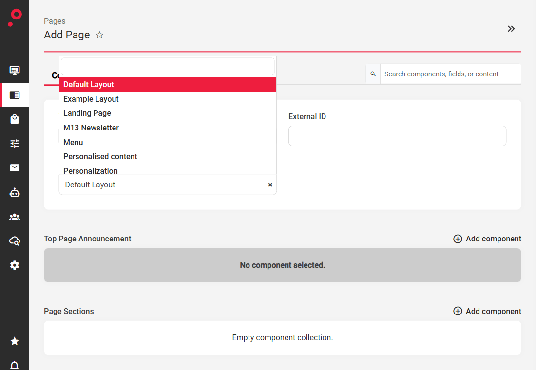
Define the Page Layout Template
(Optional) Depending on the system setup, you may see the option to select from multiple page layouts. In general, the default layout is used for building simple layout pages such as standard full-width pages.
In addition to the default layout, it is also possible to include structurally more advanced layouts, for example a Page with a Sidebar, or Page divided into two columns etc.
Depending on the selected layout, the structure of the Page admin will change accordingly which will include all the features and content areas the selected layout may hold.
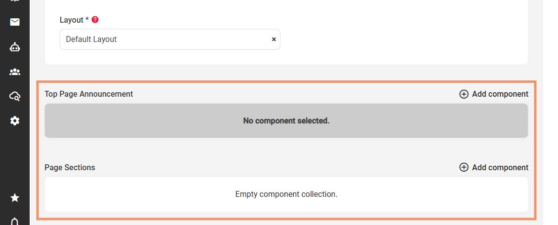
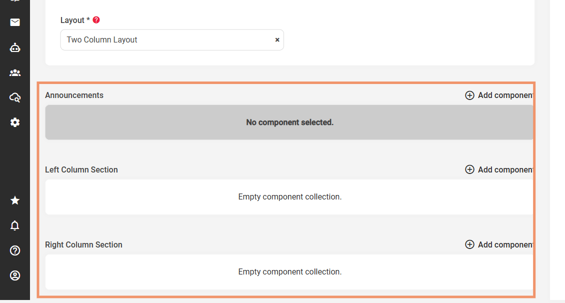
For example, the Default Layout includes the Top Page Announcement and Page Sections areas, while the Two Column Layout includes the Announcements, Left Column Section and Right Column Section areas:
Default Layout:
Two Column Layout:
Layouts can hold custom fields, single components, components collections etc. In terms of customisations there are no limits at all.
Layouts templates can have different layout areas and supported component layouts. These are managed in Customization » Layouts. This way only relevant components to the layout will be available for the admin to use, which greatly improves the user experience and ability to create quite complex pages with ease.
Add Content & Assets via Components
Pages are made up of component areas, your pages templates may have one or more areas for content to be displayed.
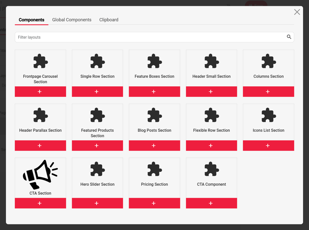
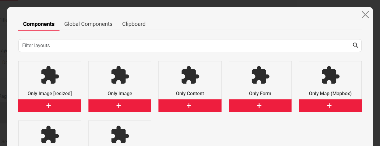
In the example below we can see a library of components that are ready to use on any page on the website. Some of them might be layout specific, however the system allows us to determine that within the admin. Instructions how to do so can be found in the Layouts documentation section.
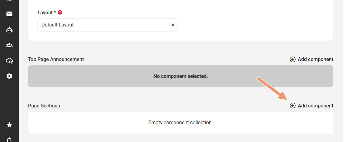
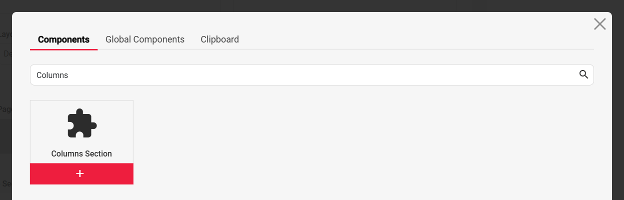
To add a new component to a Page click the “Add component” link on the area. The popup will open with all the component layouts allowed in that area, in this case the Page Sections area of the Default Layout:
The chooser has three tabs:
Components: component layouts that can be used on every page, however they will need to be configured and set up each time
Global Components: components that can be setup only once and used across many pages. The great benefit of the Global Component is that its content can be managed from one central location. So if the GC is present on 100 pages, this can be changed only once, and all the components on other pages will update accordingly at the same time. Global Components can be setup in the Content > Common > Global Components area, and added to the page via above pop-up (Global Components tab)
Clipboard: components copied from another page with “Copy to clipboard” (in a component’s “three dots” menu), ready to be pasted here
Use the “Filter layouts” box to quickly find the component you would like to use on the page, or click on the component from the list if it is already there.
Note: it is also possible to replace the “Puzzle” icons, which are set as a default for all components. This can be done in Customization > Layouts area (edit each layout and upload a custom image).
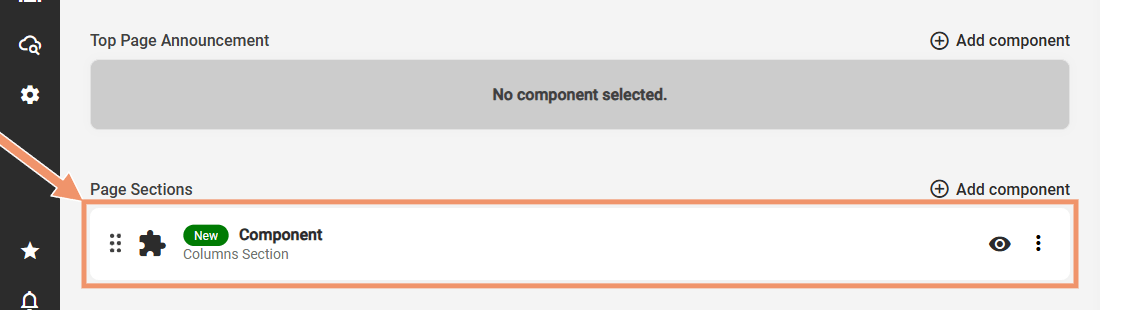
The added component will be loaded into the Page area:
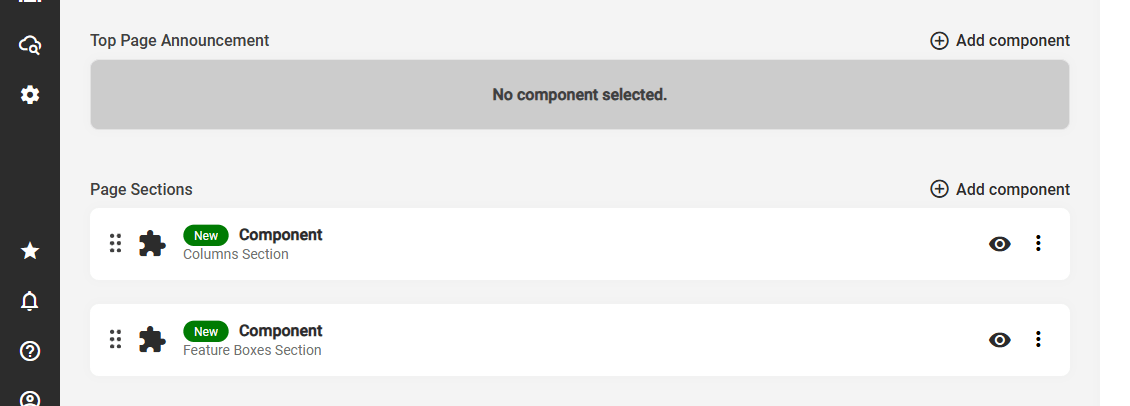
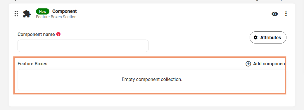
In order to build a page different components with different look and feel can be added to the list. In that case each component would be its own section on the page. To add a new component repeat the above, as an example here we will use the Feature Boxes Section component:
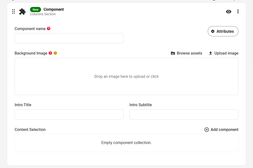
Each component will have a set of settings which can control the presentation of the content / section. For example the Columns Section component has the following:
Background Image, Intro Title, Intro Subtitle: the section’s own settings - a background image behind the columns, and the heading and sub-heading shown above them.
Content Selection: similar to Page Sections on the main Page admin, each component can have its own Component Collection area. Within the admin we can define which layouts should be included under each component, making it easier to manage as only relevant layouts will be present. In the Columns Section example the supported layouts are the “Only …” layouts: Only Image, Only Content, Only Form, Only Map and so on.
Columns Section = supported layouts:
The next step is to go back and populate the information in the Columns Section component.
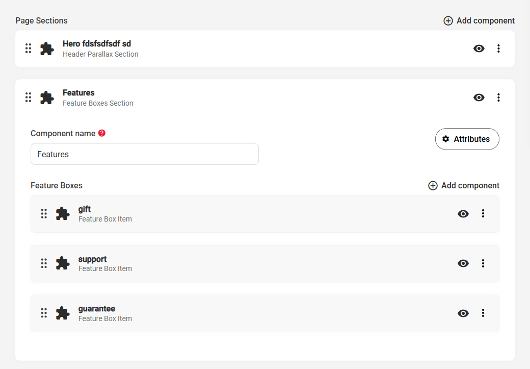
After that, we should do the same with the Feature Boxes Section. Its structure is simpler: apart from the component name it has a single component collection area, Feature Boxes, which holds one Feature Box Item per box. This demonstrates how components can be configured in many different ways, while achieving a similar end result.
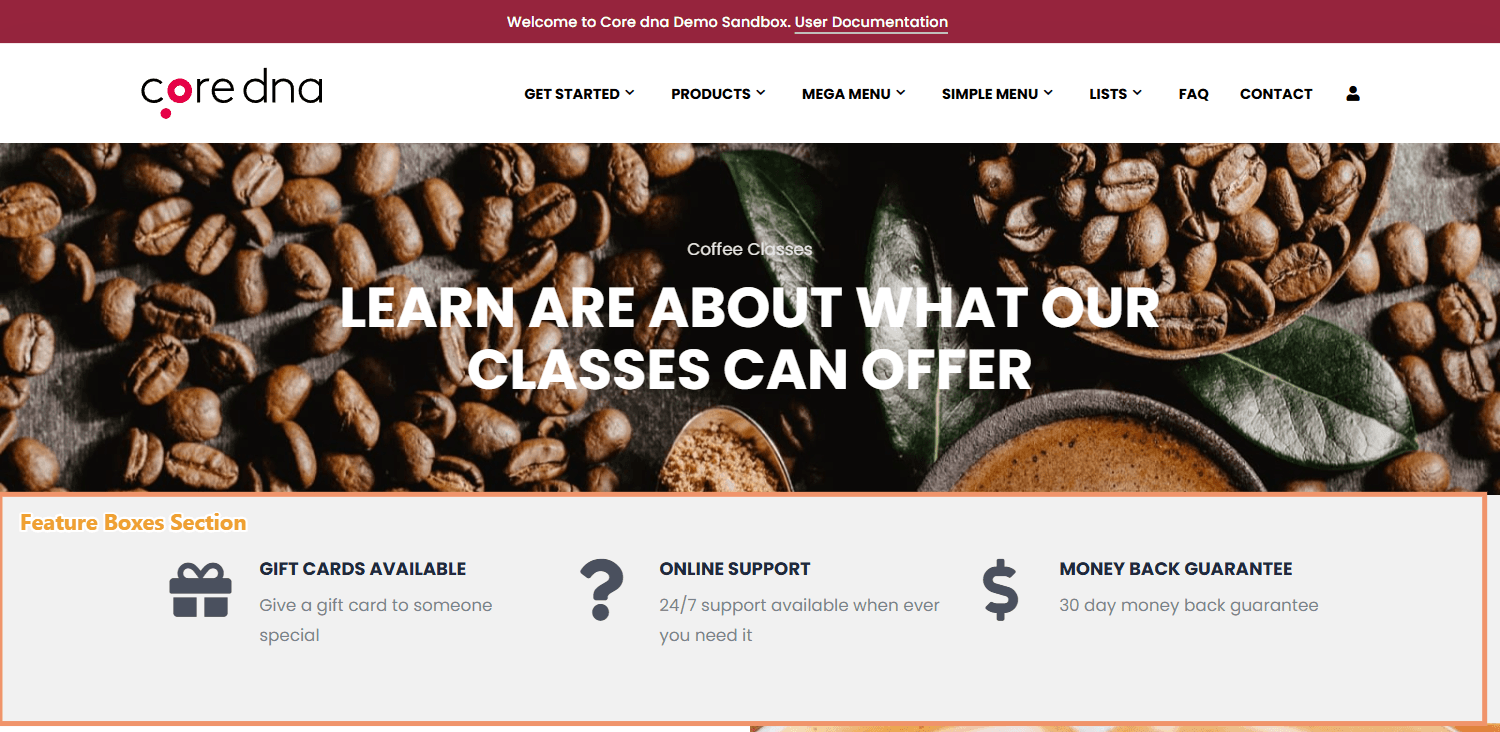
As an example of a configured page, the example site’s home page holds a Features component with three Feature Box Items:
Update SEO Settings
SEO Title - Used for optimization of the title tag
Robots settings - used to tell search engines whether to index the page and follow its links. There are 5 options:
Default (recommended), which gives no instruction, so search engines index the page and follow its links
Index & follow
Index, but don't follow
Don't index, but follow
Don't index and don't follow
Both Don't index options also keep the page out of the sitemap and the site search.
Index - allows pages be in the search engine index
Follow - allows linked pages to be passed 'link equity' for that page, i.e. to show a connection between that page and the linked pages.
Meta Description - can be used for the description on search engines results
Meta Keywords - can be used for meta keywords, used by some search engines
Canonical URL - used to be a pointer to the single source of a page. In the case that there are multiple or similar versions of pages, you can tell the search which one is the canonical version of this content. See rel="canonical" on Google Search for Developers.
Alternative URLs - used to tell search engines about other locations of the pages content. See rel="alternate" on Google Search for Developers.
Share image - can be used for certain sharing services, see meta property="og:image"
Publish the Page
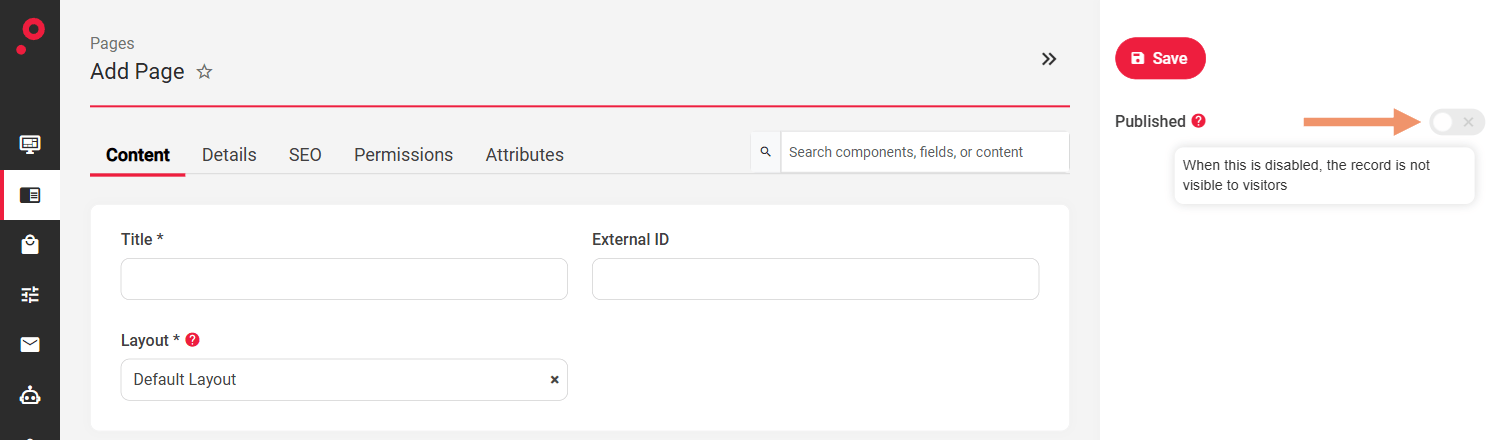
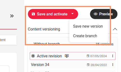
Once done with editing the page click “Save” to create the page. In order to publish the page enable the Published switch beside the “Save” button in the right hand sidebar. On an existing page the button reads “Save and activate”, and publishing is done from the Actions menu next to the page title or from the Published switch in the Pages list.
The end result can be viewed on the example site’s home page:
Core dna pages support saving drafts, versioning, publishing settings and a live preview as native functionality.
Versions and branches
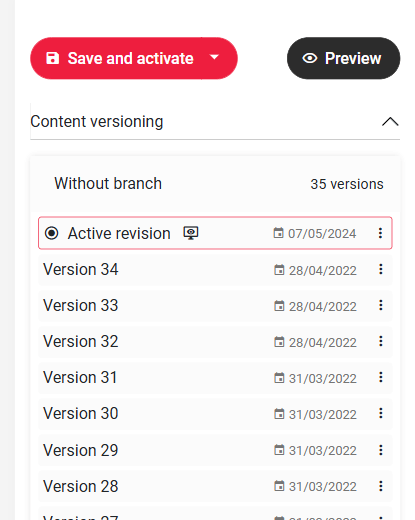
Use “Save new version”, from the arrow beside “Save and activate”, to save your work as a new version without making it live and continue at a later stage. “Create branch” starts a separate line of versions. The versions are listed in the Content versioning panel on the page admin, and the admin also autosaves a draft while you edit.
Publishing
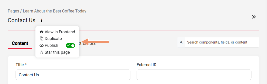
On an existing page use the Actions menu (the “three dots” next to the page title) to publish or unpublish it, view it on the frontend, duplicate it or star it. The Published switch in the Pages list does the same:
Content Versioning
All saved changes to the page are recorded in the content versioning area. This can help restore content to its previous version in the event there is an issue on the published page that needs to be resolved.
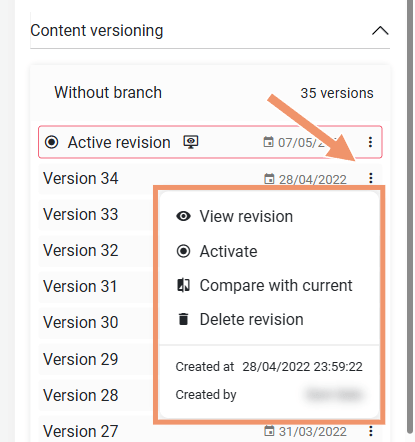
Versioning supports four actions:
Activate - make the version the current page version (restore to a previous version)
View revision - view the page as it was in that version
Compare with current - compare the version with the current page version
Delete revision (only available for super admins, not normal admin users)
Custom URL
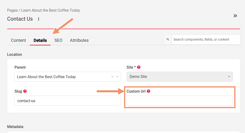
In certain circumstances, you may want to have a page be available at a different location. For example, there is a landing page at yourdomain.com/landing-page, but for organizational purposes this page is somewhere else in the folder structure (yourdomain.com/other/landing-page). With the custom URL feature, it is possible to set a link that will open the page on the yourdomain.com/landing-page URL.
Note: the slash before the URL is important. We also check to make sure the URL is valid and not currently in use, you will see the green arrow if this is an allowed URL.
Example Scenario:
We have a page available only at yourdomain.com/example
By adding /tv-campaign in the Custom URL field the same page will be available on yourdomain.com/tv-campaign
Preview
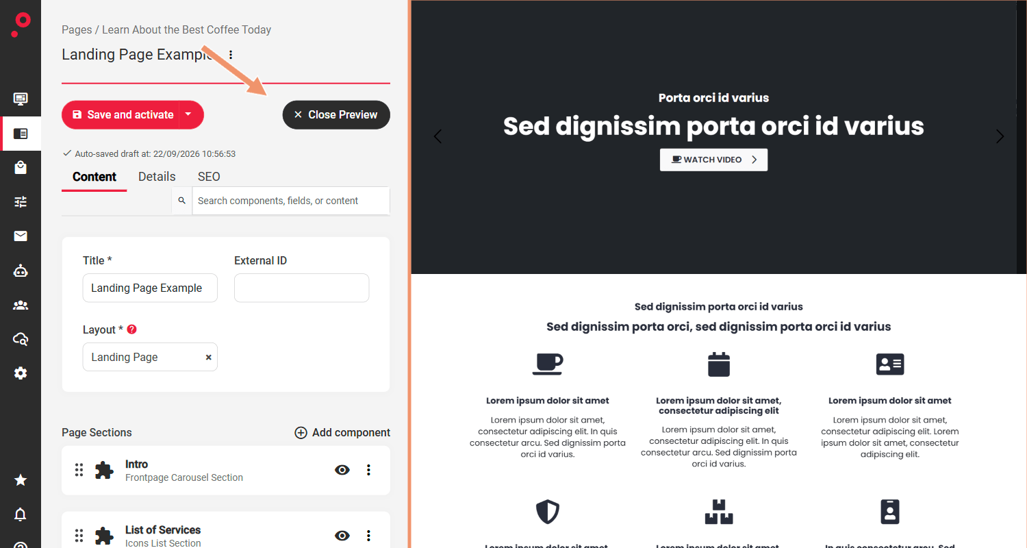
Live preview allows you to preview the content and the relevant content areas as it would appear on the page. This feature is useful to see what a page would look like before publishing a new version.
Click the Preview button next to “Save and activate” at the top of the page sidebar. Once clicked the admin page narrows to the left and the preview is shown on the right; the button becomes “Close Preview”: